In my previous blog, we configured Map visualization, Let us add few more visualizations in the same report.
If we want to show winning percentage of the all teams based on the total matches played, we can use Donut visual. Donut visual is very similar to pie chart, only difference is the center of the chart is blank which helps for better labeling of the data values. One important feature is it always shows the comparison with whole instead of comparing individual parts.
As usual, let us drag and drop it on the report canvas.

We want to see the winning percentage of the teams, which can be achieved by adding match_winner in the details and match-id in the values property. It automatically shows the count of match_id.

Here we want to show percentage, hence let us select the percent of grand total in show values as shown in below snippet.

On similar lines we can have the Pie chart as well. We can see how both visuals would look like in below snippet.

Let us add one more visual to see how many matches were played in each season. Let us use the Area chart to show his data. Drag and drop this visual on the report canvas as shown in below snippet.

We have to set the x axis as season_year and values as match_id as shown in below snippet.
Configured Area visual would be shown as shown in below snippet.

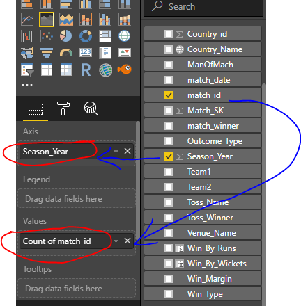
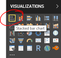
Let us add one more visualization in this report. We want to show winning analysis based on the toss decision to do the batting / bowling. Let us use the Bar chart for the same as shown in below snippets
Let us map match_winner to Axis parameter and Toss_name to show the Legend. Count of match_winner would be the value to be displayed as shown in below snippet.

Here is finally how our chart would look like.

We have learned configuring basic Donut, Pie, Area and Bar visual in Power BI.
To logically end the design of this report and start with another report in my next blog, let us extend this blog a little bit and see how tabular visual works in Power BI. Again very similar process to drop a visual on the report canvas.

Referring to my earlier posts of data modelling, we have created few custom columns in this Match table to see if the match was won by how may wickets or how many runs. Let us add those fields in the Values of the visualizations and those would be displayed in the table as shown in the below snippet.

Our configured visual would look like as shown in below snippet.
In next blog let us see the design of second report in which we would learn more about Card type of visuals and how to add custom visual in the report. I hope you are enjoying creating these visuals along with me..
Thank you for reading my blog, if you have any questions please mention in the comments and hit the like button if you like my write up.
Keep Learning !! Happy analyzing and be Powerful 🙂
Power BI: IPL Analytics- Dashboard
Power BI: Measures Vs Calculated Column
Power BI Jargons: DAX/M/Power Query
Power BI: IPL Analytics- Visualizations and Design Reports -Part 7
Power BI: IPL Analytics- Visualizations and Design Reports -Part 6
Power BI: IPL Analytics- Visualizations and Design Reports -Part 5
Power BI: IPL Analytics- Visualizations and Design Reports -Part 4
Power BI: IPL Analytics- Visualizations and Design Reports -Part 3
Power BI: IPL Analytics- Visualizations and Design Reports -Part 2
Power BI: IPL Analytics- Visualizations and Design Reports -Part 1
Power BI: IPL Analytics- Data Modeling and Transformation-Part 2
Power BI: IPL Analytics- Data Modeling and Transformation-Part 1
Start with Power BI: Connect to Data Sources

12 thoughts on “Power BI: IPL Analytics- Visualizations and Design Reports -Part 5”