In my previous blog, we have seen how to add card visuals and little bit of QNA feature of Power BI. Let us see how to add custom visual.
If we refer above image of second report, we can see a fish tank /aquarium visual with heading of Top 10 Extra runs by Bowler where fishes are of different sizes. This visual is not available in the default listed visuals in Power BI. However we can search for the visuals available in the market place. There are different ways to search such visuals.
- Either search in Google as office store Power BI visuals as shown in below snippet


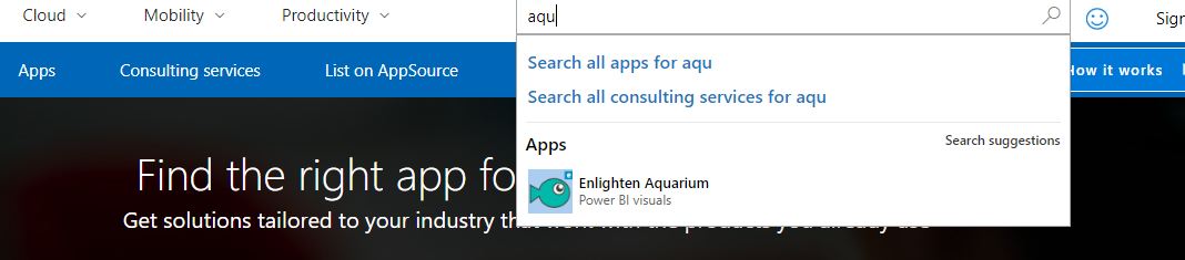
- Go in AppSource and search with the name if you already know. You can search in the top right search box or the main search box as shown in below snippets
- From Power BI desktop itself, just click on the extended menu and select “Import from marketplace”

Select the Power BI certified visuals. Select the Enlighten Aquarium visual and click on Add button. The selected visual would be added in the in visuals list.


Let us select this new visual and drag and drop on the Report canvas. As mentioned earlier we want the fishes based on the Top 10 Extra runs by Bowler and size of the fish depends on the number of extra runs. Let us see how to configure this.
Drag the Bowler field from Ball by Ball table to Fish property, so that fish represents the bowler. Drag Extra runs field to Fish size, so that fish size represents the sum of extra runs as shown in below snippet.

However this configuration would show all the bowlers and we want to show only top 10. To achieve this we need use filters. Under Visual level filters, for bowler field, select filter type as Top N. Mention the number of records, here we enter 10. Filter criteria is Extra runs as shown in below snippet.


There are different filters available in the Power BI such as Visual level filters, Page level filters and Report level filter as shown in below snippet. Those can be used as required.

We have seen how to add custom visuals in Power BI reports in this blog. Here we have created two Power BI desktop reports. Let us move to Power BI service. In next blog let us see how to develop Power BI dashboards. I hope you are enjoying developing these reports along with me.
Thank you for reading my blog, if you have any questions please mention in the comments and hit the like button if you like my write up.
Keep Learning !! Happy analyzing and be Powerful 🙂
Power BI: IPL Analytics- Dashboard
Power BI: Measures Vs Calculated Column
Power BI Jargons: DAX/M/Power Query
Power BI: IPL Analytics- Visualizations and Design Reports -Part 7
Power BI: IPL Analytics- Visualizations and Design Reports -Part 6
Power BI: IPL Analytics- Visualizations and Design Reports -Part 5
Power BI: IPL Analytics- Visualizations and Design Reports -Part 4
Power BI: IPL Analytics- Visualizations and Design Reports -Part 3
Power BI: IPL Analytics- Visualizations and Design Reports -Part 2
Power BI: IPL Analytics- Visualizations and Design Reports -Part 1
Power BI: IPL Analytics- Data Modeling and Transformation-Part 2
Power BI: IPL Analytics- Data Modeling and Transformation-Part 1
Start with Power BI: Connect to Data Sources

8 thoughts on “Power BI: IPL Analytics- Visualizations and Design Reports -Part 7”